
How to Check If Your Website Is Mobile-Friendly (And Why It Matters in Springfield)
- Johnathon Crowder
- Aug 3
- 3 min read

In Springfield, MO, more than half of your potential customers are visiting your website on their phone. If your site doesn’t look or work right on mobile, you’re not just losing traffic—you’re losing trust, leads, and sales.
This guide breaks down how to check if your site is mobile-friendly, why it matters for your local business, and how to fix it fast (even if you're not a tech person).
✅ Why Mobile-Friendliness Matters for Springfield Businesses
65%+ of traffic is mobile. Most local searches happen from phones. If your site doesn’t load properly or requires pinching/zooming, people bounce.
Google ranks mobile-first. Since 2019, Google primarily uses the mobile version of your site to determine rankings. If it’s broken or slow, your SEO suffers.
Your competitors are improving. If their site is fast and friction-free on mobile and yours isn’t, you’re quietly giving them your leads.
Trust and brand reputation. A poor mobile experience makes you look outdated or careless, even if your services are amazing.
✅ Step-by-Step: How to Check If Your Site Is Mobile-Friendly
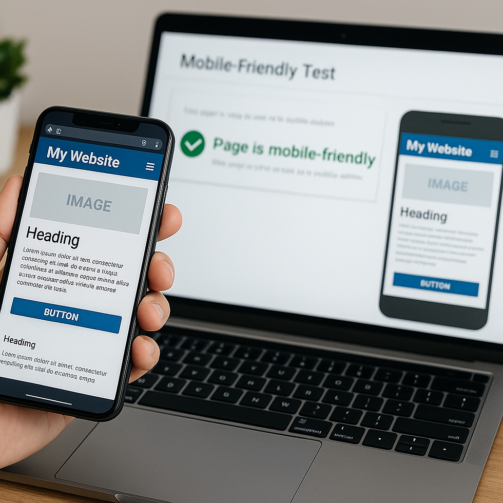
1. Use Google’s Free Mobile-Friendly Test
Paste your homepage or any key page URL.
Google will scan it and show whether it passes.
It’ll flag issues like:
Text too small to read
Clickable elements too close
Content wider than screen
Tip: Test several pages, not just your homepage.
2. Run a PageSpeed Test
Go to: https://pagespeed.web.dev/
Enter your URL and check both Mobile and Desktop scores.
You want to score 90+ on mobile.
Key mobile issues to watch for:
Slow server response
Uncompressed images
Too many scripts slowing the load
3. Test It Yourself on Multiple Phones
Open your site on an iPhone and Android device.
Check buttons, forms, images, text.
Pretend you’re a first-time visitor:
Can you find the phone number fast?
Is the CTA button visible without scrolling?
Can you easily fill out the form?
4. Use Chrome DevTools for Emulated Testing
If you're on desktop:
Right-click on your site > "Inspect"
Click the device toolbar icon (top-left)
Choose a phone model from the dropdown
See how your site adapts across screen sizes
✅ What a Mobile-Friendly Site Looks Like
Text is large enough to read without zooming
Buttons are easy to tap with your thumb
Images are scaled correctly and not overflowing
Menus collapse into a simple icon (hamburger menu)
No popups or elements that cover the screen
Fast loading—under 3 seconds
Tap-to-call phone number and click-to-message options
✅ How to Fix a Site That Fails Mobile
Use a responsive theme if you're on Wix, Squarespace, or WordPress
Simplify layout and content for smaller screens
Make buttons and form fields larger (min 44px tall)
Compress all images with TinyPNG or Squoosh
Avoid plugins that slow things down
Ask for a mobile usability audit from a local expert
✅ Why This Matters for SEO in Springfield
Google Maps results (Local Pack) often prioritize mobile-ready businesses
Local Springfield competition is increasing online
Google penalizes poor mobile experiences
A mobile-friendly site increases leads and conversions
🌟 Want Help Making Sure Your Site Works on Every Device?
At Crowder Code and Design, I help Springfield businesses:
Fix mobile layout issues
Speed up their websites
Improve SEO and mobile rankings
Get a free custom video audit of your site:
I’ll show you exactly what’s working (and what’s broken)
Compare your site to local competitors
Give you 3+ easy wins you can fix this week
No tech talk. Just real fixes that get you more leads.


Comments